Describe the administrative restrictions on Standard Reports
A user can only report information that they have “read†access to. This means that if they cannot see a certain user’s data, they cannot report it either. This applies for both field level security and object level security. Page layouts have no impact on reporting capabilities.
Run a Standard Report
Click reports tab, click on report. “Run Reports†permission required. Standard reports are the ones that come pre-installed. They cannot be modified or removed.
Create a Custom Report
Reports tab, Create New Custom Report. “Create and Customize Reports†permission required. You can also run a report, make changes and then save it as a new report.
Search for Custom Reports
On the reports tab- When you click “Find Reports†only custom reports are listed.
Explain the differences among report types
Tabular – simple list (CSV style report). Provides totals for the entire list of data.
Summary – sorts and sub-sorts data by row. Provides totals for each section of sorted data (rows).
Matrix – sorts and sub-sorts data by row and column. Provides totals for each section of sorted data (rows & columns).
Explain Custom Report Types
Pro+ edition, permission “Manage Custom Report Types†required. A report type links data from different objects together through lookup or M/D relationships. The link travels the reverse direction of the relationship for Report Types (the data in the related list, not the lookup relationship itself). For instance, if Account is your primary object then you can link to Contacts and Opportunities. Whereas if Contacts were your primary object, you could link to activities but not accounts. Limit of 4 objects per report type.
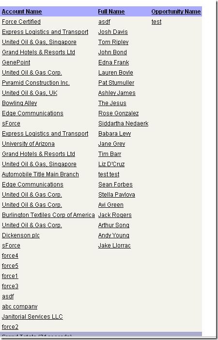
Example: Show all accounts, and any related contacts, and any related opportunities.
Note the “with or without related records†and the result (same as top line of the above report):
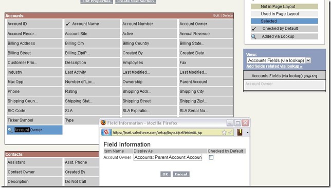
You can add data from related lists as custom fields on your report. This is a fantastic alternative to creating simple cross object formulas to accomplish the same on standard reports. In my example I create a field for the owner of the parent account. See the “Add fields related via lookupâ€â€¦ its your friend.
Create charts to display Report results
Graphs are not available for Tabular reports. Grouping must be selected. After all, you would only have one bar!
Columns to total becomes the bar/line data portion of the graph. The grouping becomes the unit that is measured. For instance, if I group by “Account Owner†and sum number of records:
This process is very similar to dashboard creation, and that is probably easiest to learn just by doing. Create a sample summary and matrix report, and get an understanding of the differences between the two, as well as all of the report options.
Use Advanced Filter criteria to narrow Report results
Standard filters:
- View: Selection of object by ownership (mine only, team, etc.)
- Date range: Selection of any date range on the object
Advanced filter:
- Filter operators
- equals
- not equal to
- less than
- greater than
- less or equal
- greater or equal
- contains
- does not contain
- starts with
- includes (multi-pick list)
- excludes (multi-pick list)
- Advanced Options
- Allows you to set AND/OR per filter criteria line
The key limitation with filtering is that it cannot accept variables on both sides of the equation. For instance, you could not create a filter that says “show me all accounts that contain the account’s state†(because account state is a variable) but you could say “show me all accounts that contain the word ‘California’â€. Anything to the right of the formula must be static.
Create Custom Summary Formulas
Columns to total- New Formula.
Result of formula: Number/Percent/Currency
Options to formulate:
Record Count Sum
Any numeric field: Sum/Largest Value/Smallest Value/Average
Summary formulas let you perform the above math across the entire report. You cannot inject any logic into these formulas.
Choose settings for Conditional Highlighting
Select Chart & Highlights. Select a summary total, select values and colors for each point. This will only color highlight summary totals, and is only available for Summary/Matrix reports accordingly.
Describe the capabilities and purpose of a Dashboard
A dashboard is a compilation of different reports or external data. This collection of reports can be designed for a specific purpose. For instance, a Sales dashboard may have information about sales for each sales rep, number of calls made, etc. A dashboard is only as current as its last refresh. Dashboards can be refreshed on a schedule (and emailed upon refresh), or manually. Ultimately their purpose is to provide information from several reports in one location.
List Dashboard component types
- Chart
- Table
- Metric
- Gauge
- Custom S-Control
Create a Dashboard and add components to it
View some of the salesforce dashboards as examples. Create your own- make sure to try out each report type and dashboard metric.
Print and export Reports
Both options are available from the report itself. Export is available from the reports list. Printable view gives you an excel document formatted for pri
nting. Export gives you a CSV/Excel document with sort-friendly data.
Email and schedule a refresh of a Dashboard
EE/UE only. Up to 5 contacts outside of Salesforce users can be emailed. From the refresh menu on the dashboard, select schedule. See “Scheduling a dashboard refresh†for more info.
Define Running User and how it affects the Dashboard results
The dashboard will use the permissions of whoever is selected as the running user. This means that if a system administrator is the running user, all data can be seen and subsequently reported, while a standard user in a lower role may display different results. However that standard user could potentially have permission to view the administrator’s dashboard. In that case the user would have permissions to view the top-level information in the dashboard. Once they clicked into a report within the dashboard, that report would display whatever records they have access to view (which could potentially be different than the top level dashboard information).
Example:
Roles:
- Management
- Sales User
Administrator creates report for all opportunities (includes Management and Sales User). This report is added to the sales dashboard which is viewable by all users. Sales User can see the top level detail in the dashboard. Now, let’s say that the sharing model for opportunities is set to private, which means that sales user would not be able to view anyone else’s opportunities. When sales user clicks on a report within the dashboard, that user will be limited to seeing the records that he has permission to view (only his own), and the totals in the report would be different than the dashboard itself.


